Shared Interactions
Working with interactions
What Is a Shared Interaction?
When you use a Shared Interaction, the changes it triggers apply over many states, not just the one where you defined them.
Applying the Same Changes Over Many States
When you define a hover interaction for an element, for example, you usually want it to show regardless of what goes on in the rest of the screen. That is, the other elements in the screen can be in any state, and you would want the tooltip to show over them, in addition to them, rather than setting the whole screen to a specific, fixed state.
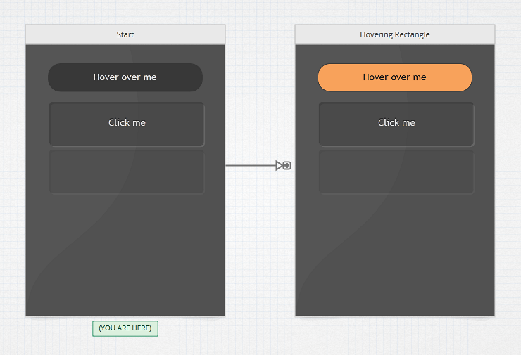
In Indigo Studio, we support this through what we call a Shared Interaction. In the Interactions Explorer, they are represented using an arrow and plus icon, like this:

Combined states
Normally, when you define a new state for a screen, Indigo will make sure that the screen looks exactly as you designed it in that state. As noted above, this is not always desirable. Sometimes you want to show things in addition to the current state; typical examples of this are overlays like rich tooltips or some kind of global navigation or panel. Using a Shared Interaction means that the changes for the resulting state can be combined with any other state. So Indigo will only apply the changes you design to whatever state the shared interaction is triggered from.
As you can see, you have to be careful when using shared interactions as it can result in odd and unexpected combinations. That's why it's best to only use them for changes that make sense in any of the states that the interaction can be triggered from.
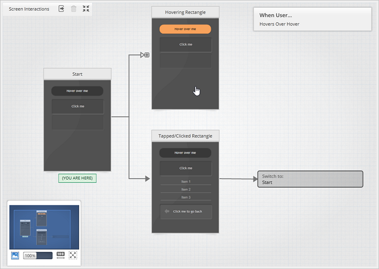
In the Interactions Explorer below you can see a screen interaction flow including three states, one of them (Hovering Rectangle) is the resulting state of a Shared Interaction.

This means that, when running the prototype, the changes designed in the Hovering Rectangle state can be applied either combined with the Start state or the Tapped/Clicked Rectangle state. Sometimes you need to run your prototype and test these kinds of interactions out in each state to ensure it looks right when the changes are applied wherever they can be shared.
The only combined state you will see in the Interactions Explorer is the one you created the interaction from. In the example above, you only see the Hovering Rectangle as it was designed from Start. However, when running, it can also be applied with the other state. We hide these combined states because it would quickly make the Interactions Explorer impossible to follow, especially when you have a number of Shared Interactions defined in a larger prototype.
Switching between shared/not shared interactions
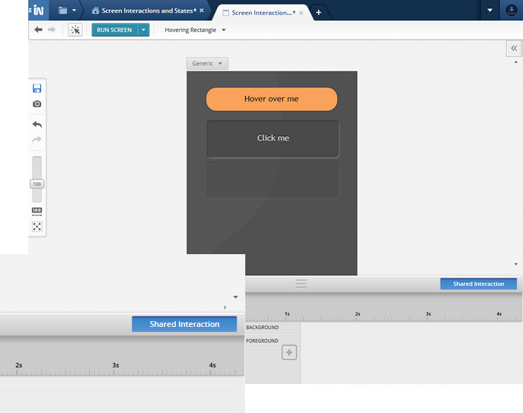
Hover and other toggle-based interactions are shared by default, but you can always click the Share Interaction button on the Animation Timeline panel to toggle whether the changes you're designing apply over any state where the interaction is available to users:

Prototypes
Take a look at this prototype:
Learn More
Here are some suggested topics: