Creating Your First Responsive Web Page Layout
Designing responsive web pages
Teaser
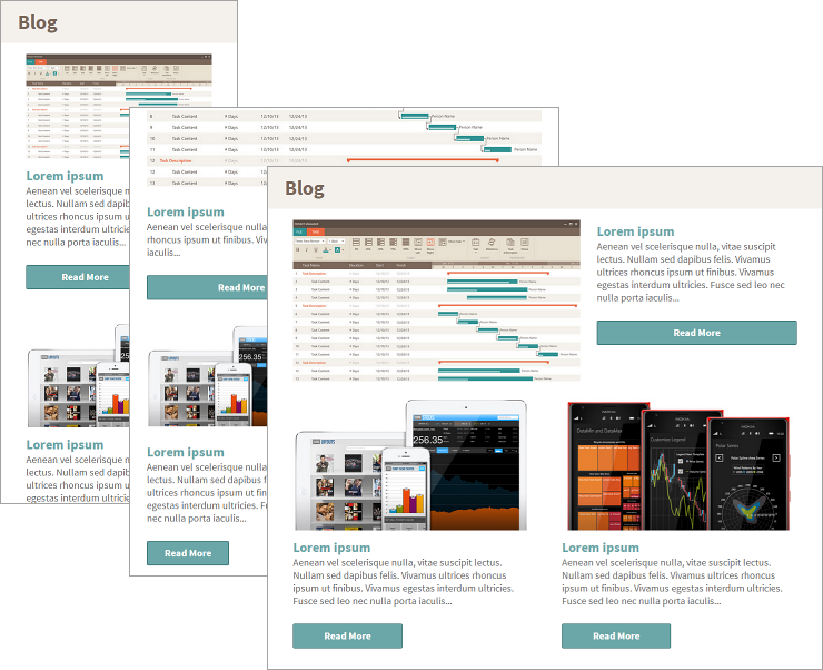
At the end of this topic you will have a responsive web page showing a list of blog articles, with custom layouts for phone, tablet and desktop.
In Brief
These are the steps of the procedure.
- Selecting a responsive layout.
- Adding content to the Bootstrap container.
- Customizing the layout for the different breakpoints.
- Running the screen preview.
Step By Step
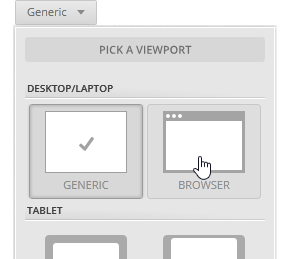
(a-1) 1. Select a responsive layout.
In a new screen, pick the browser viewport.
Click on the
Mobile-First Approachbutton.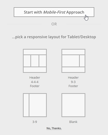
A Bootstrap container is added to the canvas. It has one row and three cells stacked one on top of the other.
You can see the
Responsive Breakpoint Pickernext to theViewport Picker. The XS-Phone breakpoint is selected.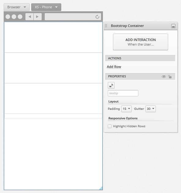
The Bootstrap container uses a 12-column structure for its layout. In Indigo we use the name cell instead of column for the elements inside the Bootstrap container, because each row can have any given number of cells which might stack, depending on their column span.
(a-2) 2. Add content to the Bootstrap container.
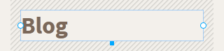
Add a title to the first cell.
Double click the first cell to enable edit mode, and use Alt+Click to add a title.
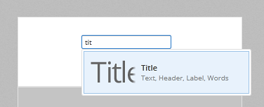
By default, the title is set to stretch mode, and it has a column span of 12.
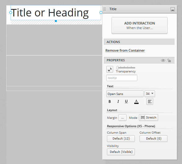
If you resize an element with mode set to stretch from the sides, you are actually adjusting its column span (and the offset, if you resize from the left).
The title in the example is brown, bold, and has a margin of 15. Also, the cell background color is beige.
Add an image to the second cell.
Select the second cell to enable its edit mode, and use Alt+click to add an image. If you are not in edit mode you can drag and drop while holding the Space key to add an element to a cell.
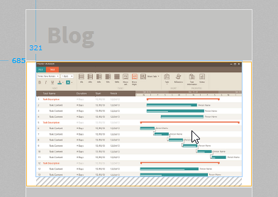
Indigo resizes the image to fit the width of the cell.
Add a title element, some text, and a button in the same cell as the image.
These elements have a default column span of 12, so they will stack as you add them. By default, the cell's content determines its height. If you resize the cell manually, this setting will be lost. You can go back to it using the
Size to Contentaction available from theProperties Panel.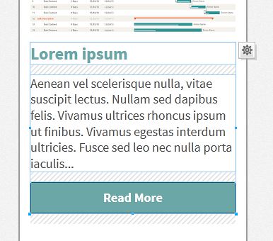
By default, elements have a bottom margin set to 15 pixels. Now that you have more than one element in the cell you can see how the margin is useful to space elements in a cell.
To give them a more polished look, the elements in the cell have custom margin settings.
To duplicate the cell, click on the
Duplicate Cellaction. Do it twice to end up with 3 articles.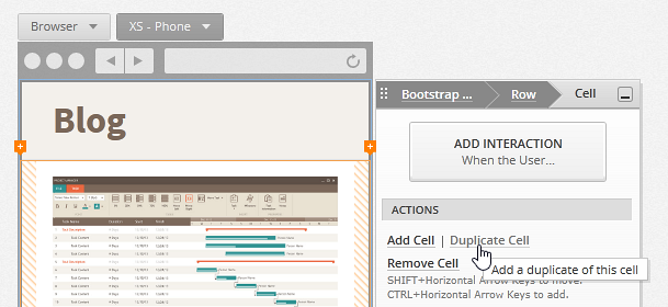
(a-3) 3. Customize the layout for the different breakpoints.
Use the
Responsive Breakpoint Pickerto switch to the tablet breakpoint.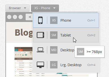
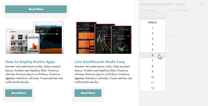
Adjust the column span of the cells for the second and third articles so that they are displayed one next to the other. Drag until column span is set to 6 for each one of them.
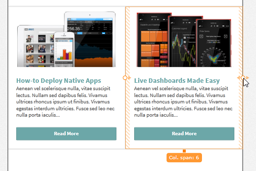
Adjust the column span of the buttons so they don't look so wide.
Use Space+click to select them and set their column span to 4.
The
Responsive Optionsare inherited from the smaller breakpoints, and the values you set for them in one breakpoint (e.g., Phone) are preserved for the following ones (e.g., Tablet). In this case, to have the second and third cells displayed next to each other, their column span is set to 6 .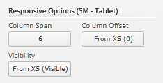
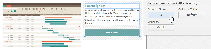
To design a desktop layout, use the
Responsive Breakpoint Pickerto switch to the desktop breakpoint.The options you set for the tablet breakpoint are inherited.
Set the column span of the image to 7 and for the rest of the elements to 5 to make the first article a featured article.
(a-4) 4. Run the screen preview.
Click the
Run Screenbutton to preview your prototype.Select the
Fit to Browseroption in thePlayer Toolbar.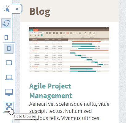
Resize the browser to see the different breakpoints you've just designed.
Prototypes
Take a look at this prototype:
- Blog Page (Responsive): view or go to the
Workspacestab in theApplication Menu.