Targeting Platforms and Screen Sizes
Designing with Screens
Overview
Indigo Studio helps you create and try out prototypes for different devices and platforms with the use of viewports and chromes. Together with the HTML viewer, you can get a realistic feel of prototypes that are targeted at modern mobile devices.
Viewport and Canvas
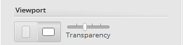
The viewport defines the visible area of the screen. You can choose between a generic desktop viewport, which is the default with no chrome, or any of the options that provide a chrome. The chrome is the visible container that makes it look like your design is in a target device/window type.
When viewing your prototype in a browser, you'll see the corresponding device chrome for added visual context.
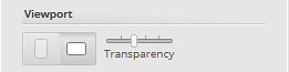
You can also set the transparency on the chrome in the designer all the way to hidden if that´s what you want.
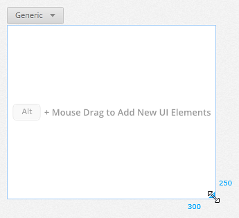
The canvas is all of the screen that can be viewed by users. It has its own size, independent of the viewport. This is useful for enabling scrolling/panning—you just make the canvas bigger than the viewport in whichever directions you want users to be able to pan/scroll. If you want to learn how to simulate scrolling and panning using the canvas size, read Simulating Scrolling and Panning.
If you want to restrict panning/scrolling, set the canvas to be the same size as the viewport. Then, put the extra content outside the canvas and move it in response to a user action. You can animate the changes by moving your content and then resizing the move action from the timeline in the Animations Timeline panel.
This approach is useful if you want to simulate custom screen-to-screen transitions. You simply create multiple containers in one Indigo Screen, then move them into view as you want them to become visible. However, we offer most of the common screen-to-screen transitions, so we recommend just creating separate screens and using those for this purpose.
Resizing the viewport/canvas
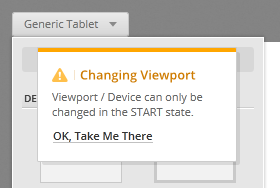
The viewport and the canvas have their own, independent sizes. For generic tablet, phone, and browser you can change both the viewport and the canvas sizes. The viewports for iOS have a fixed size, but you can still change the canvas size.
To change the viewport size, use the Platform Picker.
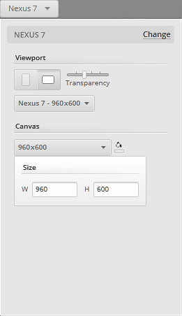
To change canvas size, you can either use the Platform Picker or drag from the adorner in the bottom right corner of the canvas.
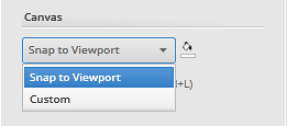
If you chose a viewport other than generic and want to go back to having the same size for your viewport and canvas, just choose the Snap to Viewport option from the size dropdown menu in the Platform picker.
Device orientation
You can design prototypes targeted for portrait or landscape orientations. To explore this, choose a device orientation in the Platform properties panel.
Choosing a Mobile Platform
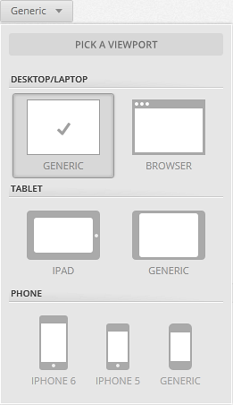
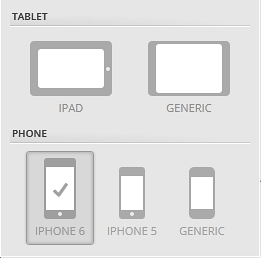
Indigo offers several options for mobile devices, as well as specific support for iOS. To select a platform for your prototype, use the Platform Picker. If you are designing for tablets or phones different from iOS such as Android or Windows Phone/Tablet, you can choose the generic options. If you are designing for iOS, you can use the iPad and iPhone options from the Platform Picker.
In addition to the viewport, Indigo provides a whole set of interactive, iOS-themed controls available in the Toolbox. For more on this, see the Designing for iOS topic.