Hiding Cells in a Bootstrap Container
Designing responsive web pages
Teaser
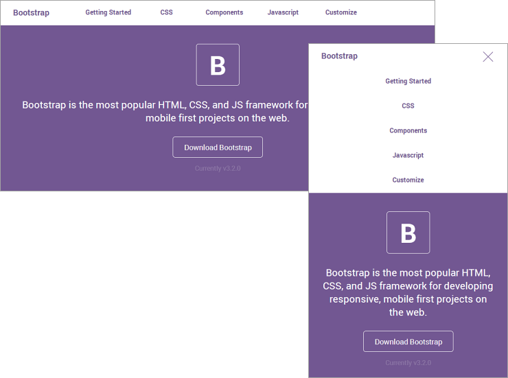
At the end of this topic you will have a responsive header with navigation that looks different for phone and desktop.
What You Need
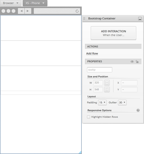
You need to start with a screen with a Browser viewport and the default responsive layout for phone. For instructions, see Creating Your First Responsive Web Page Layout.
In Brief
These are the steps of the procedure.
- Adding elements to the row.
- Hiding a cell in the row.
- Adding an interaction to display the hidden cell.
- Making changes to display the cell in the desktop breakpoint.
- Running the screen preview.
Step By Step
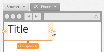
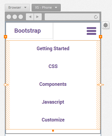
(a-1) 1. Add elements to the row.
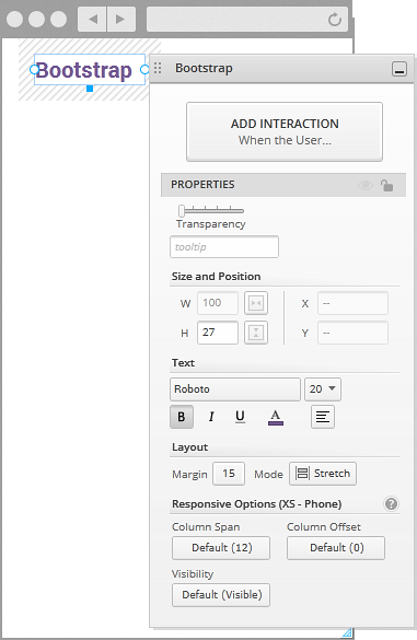
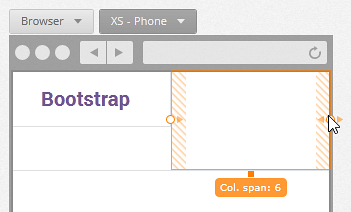
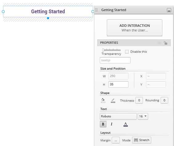
Add a title in the first cell, and set the column span for the cell to 6.
The title in the example has customized font settings (Roboto, size 20, bold, purple) and a margin of 15.
Set column span for the second cell to 6, so both cells are displayed side by side.
Add an icon to the second cell you just resized.
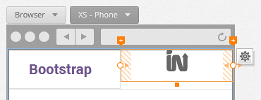
To make it look like the one in the example, select the menu icon, give it the same purple color as the title, and align it to the right.
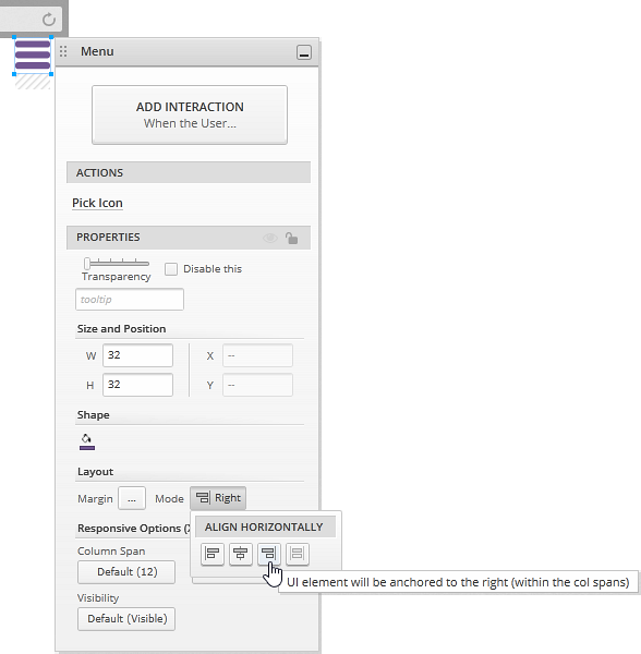
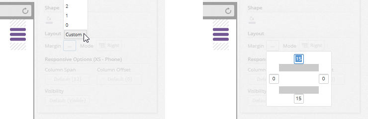
To set a top margin of 15, select the custom option from the dropdown, and then type a value for the top margin. The bottom margin is set to 15 by default.
(a-2) 2. Hide a cell for the phone breakpoint.
The third cell in the row has a column span of 12, so it is displayed below the cells from the previous steps. This will be the hidden cell with the navigation buttons.
Add a button with a top margin of 10.
The one in the example has a white background with purple text, font size Roboto size 16, and a thickness of 0 so its borders aren't visible.
Create four more buttons like the first one.
Set the visibility of the cell to Hidden.
Click on the cell to select it and change its
Visibilityto Hidden, from theResponsive Optionssection of theProperties Panel.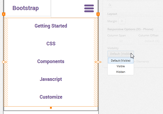
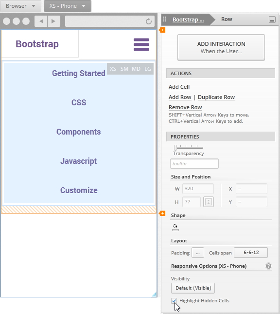
Select the row and check the
Highlight Hidden Cellsoption.The cell you hid is now displayed with a sky blue background and you can see the different breakpoints where it's hidden in gray.
(a-3) 3. Add an interaction to display the hidden cell.
Click on the menu icon, and add a tap interaction to a new state with the
Toggle Backoption checked. If you don't know how to do this, see Adding Your First Interaction.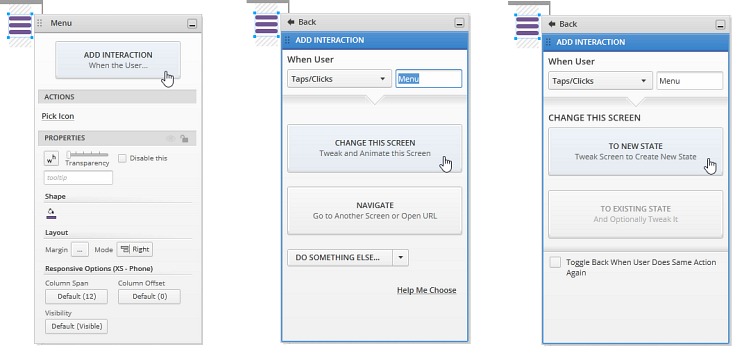
In the new state, make the cell visible by changing its
Visibilityin theResponsive Optionssection of theProperties Panel.You can also change the icon to display a cross. With the
Toggle Backoption you set in the previous step, clicking on the icon will hide the buttons.This is what your
Interactions Explorerlooks like after these changes.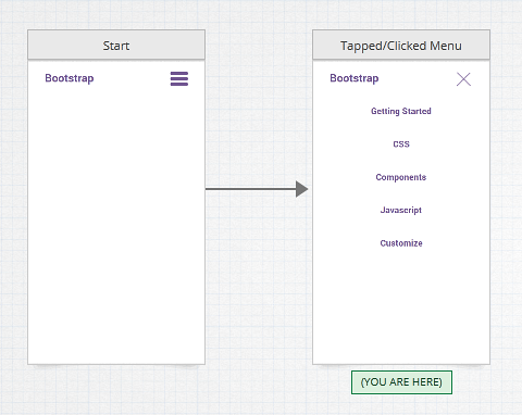
(a-4) 4. Make changes to display the cell in the desktop breakpoint.
Back in the start state, use the
Responsive Breakpoint Pickerto switch to theDesktopbreakpoint.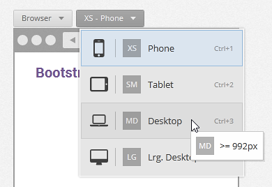
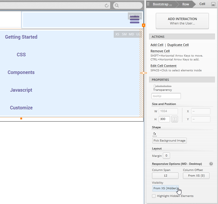
Select and hide the cell with the menu icon.
Hide the cell with the navigation buttons.
Click to select the cell, and notice how the visibility is inherited from the phone breakpoint (XS). Make it visible for desktop (MD).
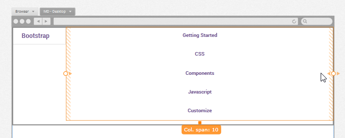
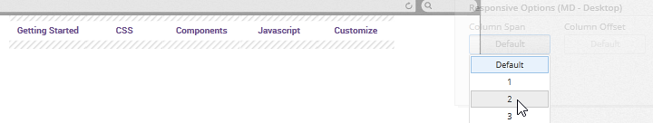
Adjust the column span of the cell where the title is and the one with the navigation so they are displayed side by side.
Give the title cell a column span of 2, and the navigation cell a column span of 10.
Select all the buttons and give them a column span of 2.
(a-5) 5. Run the screen preview.
Click the
Run Screenbutton to preview your prototype.Select the
Fit to Browseroption in thePlayer Toolbar.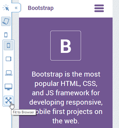
Resize the browser to see the different breakpoints you've just designed.