HTML Code Generator
Generating code snippets
The HTML generator produces CSS, HTML, and JavaScript code.
In this document you'll read about the kind of code generated for different scenarios.
- Basic snippet structure
- Stylesheets
- Interactions
- Animations and timeline actions
- Responsive layout
- Shapes and icons
- Grid, tree, and drop down
About the code
| For | the generator uses |
|---|---|
| Basic DOM manipulation | jQuery |
| Grid, Tree, DropDown | IgniteUI |
| Progress Bar, Slider, Tabs | jQueryUI |
| Other Indigo elements | HTML |
| Styles | CSS |
| Responsive Layout | Bootstrap |
| Touch interactions | Hammer.JS |
There are two files for common code:
- Indigo-codegen.js
- Indigo-codegen.css
(a-1) Basic snippet structure
Snippets have some CSS and HTML code. This is the snippet for a default button:
/* Initial styles */
.button1 {
    background-color: #f9f9f9;
    border-color: #b9b9b9;
    border-style: solid;
    border-width: 1px;
    border-radius: 0px;
    font-family: 'Open Sans', Arial, sans-serif;
    font-size: 13px;
    color: #282828;
}

#button1 {
    display: block;
    left: 34px;
    top: 36px;
    width: 80px;
    height: 35px;
    position: absolute;
}
<button id="button1" class="button1">Button</button>
For selected elements in the designer, Indigo generates two CSS selectors.
Selector | Used for | For the button | Naming ------------- | ------------- | ------------- class selector | style properties that can be shared among multiple instances of the same element | font, colors, and border properties | the element type plus a sequential number ID selector | properties of a specific instance of an element | visibility and positioning | the name of the element, if it’s set in Indigo, or its type plus a sequential number
If two or more elements of the same type share the same set of properties, the class is shared among multiple elements.
(a-2) Stylesheets
If there is an active stylesheet in your project and you generate a snippet for an element using a particular style defined in it, the generated CSS class will use that style name. For example, if you have a button using a style called PrimaryActionButton, you'll get an HTML button with class PrimaryActionButton, and that PrimaryActionButton class defined in the CSS stylesheet.
/* Initial styles */

#button1 {
    display: block;
    left: 34px;
    top: 36px;
    width: 80px;
    height: 35px;
    position: absolute;
}```
```html
<button id="button1" class="PrimaryActionButton">Button</button>```
```css
.PrimaryActionButton {
    background-color: #f9f9f9;
    border-color: #b9b9b9;
    border-style: solid;
    border-width: 1px;
    border-radius: 0px;
    font-family: 'Open Sans', Arial, sans-serif;
    font-size: 13px;
    color: #282828;
}```

If you change a property in the button, you'll get a new class selector with that setting. The HTML tag for the button will have the two CSS classes. The following code is the result of setting the text to bold in the button of the previous example:

```css
/* Initial styles */
.button1 {
    font-weight: bold;
}

#button1 {
    display: block;
    left: 34px;
    top: 36px;
    width: 80px;
    height: 35px;
}
<button id="button1" class="PrimaryActionButton button1">Button</button>
(a-3) Interactions
You can see JavaScript/jQuery code for an interaction only in the state where you added it. If you add a Click interaction to the example button, you'll see the following code in the Code Snippets Panel:
// Setup new interactions
$("#button1").click(button1Click1);
Indigo Studio doesn't support full screen code generation, so it doesn't generate the code for transitioning from one state to the other. This means the code for JavaScript events is not provided.
If you click the Open in HTML Page button in the Code Snippets Panel, the code will have the function defined as below:
function button1Click1() {
// Insert code to navigate to state 'button1Click1'
}
Most of the interactions use standard jQuery event handlers. Here's an interesting example of generated code for an interaction triggered by setting a specific value in a textbox:
$("#textbox1").on('input', function(e) {
    if (e.target.value === "/gliphy") {
        textbox1TextChanged1();
    };
});
For touch interactions, the generator uses the Hammer.JS JavaScript library. Defining a swipe right interaction over a button will produce the following snippet:
$("#button1").hammer().on("swiperight", button1SwipeRight1);});
(a-4) Animations and timeline actions
The generator uses CSS code for animations whenever possible, and JavaScript code when using CSS is not possible.
In the Animation Timeline below you can see resize, move, and set text actions for the button. The resize and move actions are animated.
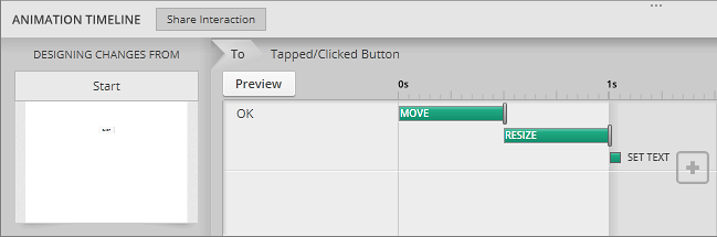
The generated CSS for this scenario has a class selector with the state name (button1Click1), and an ID selector that reflects the changes in this specific element. For each animation there’s a CSS animation property pointing to the corresponding keyframe and setting duration, delay, and easing.
/* State button1Click1 */
.button1Click1 #button1 {
    animation: button1Click1-button1-height-width 500ms ease-in-out 0ms forwards,
               button1Click1-button1-left-top 500ms ease-in-out 500ms forwards;
}

@keyframes button1Click1-button1-height-width {
    from {
        height: 35px;
        width: 80px;
    }
    to {
        height: 46px;
        width: 87px;
    }
}

@keyframes button1Click1-button1-left-top {
    from {
        left: 34px;
        top: 36px;
    }
    to {
        left: 49px;
        top: 41px;
    }
}
Changing the text of an element can't be animated but in this example there is a delay that has to be included in the code. This is one of the properties that can't be animated using CSS, so a setTimeout JavaScript function is generated for the action, with the corresponding delay:
// Set Delayed Non animatable Properties
window.setTimeout(function() {
    $("#button1").text("OK");
}, 1050);
(a-5) Responsive layout
Generated snippets use Bootstrap when there's a Responsive layout in Indigo screens.
The following image shows the example button in a cell with 12 columns in the XS form factor, 3 columns in the SM form factor, and 2 columns in the Desktop form factor.
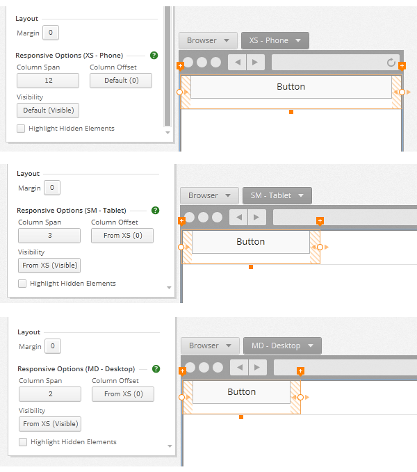
For the Bootstrap container the generator creates a div with the container-fluid bootstrap class. The DIVs for the row, cell, and button have other CSS selectors for their specific style properties. This is the resulting code:
<div id="bootstrapbox1" class="container-fluid">
    <div id="row1" class="row row1">
        <div id="cell1" class="bs-cell col-xs-12 col-sm-3 col-md-2 cell1">
            <button id="button1" class="col-xs-12 button1">Button</button>
        </div>
    </div>
</div>
To respect the bootstrap semantics, sometimes the code generator wraps elements inside a div called cellwrapper. This happens when you add a margin to an element, or set its alignment for something other than the default Stretch alignment.
The snippet below is for an element with a margin of 5px and horizontally centered:
#cellwrapper1 {
    padding: 5px;
}

<div id="cellwrapper1" class="col-xs-12 horiz-center cellwrapper1">
    <button id="button1" class="button1">Button</button>
</div>
The indigo-codgen.css file includes some CSS classes for horizontal alignment that make the code more readable:
.horiz-stretch { width: 100%; } .horiz-center { text-align: center; } .horiz-right { text-align: right; }
(a-6) Shapes and icons
Shapes and Icons are generated with SVG.
The code below shows the snippet for a Triangle. The stroke properties are defined in a CSS class and the path is defined in the SVG HTML tag. Visibility and position properties are defined in the ID selector, like with any other element.
.triangle1 path {
    stroke: #5fb5cc;
    stroke-width: 2;
    fill: #e3e300;
}

#triangle1 {
    display: block;
    left: 0px;
    top: 0px;
    width: 100px;
    height: 120px;
    position: absolute;
}
<svg xmlns="http://www.w3.org/2000/svg" version="1.1" preserveaspectratio="none" id="triangle1" class="triangle1" viewBox="-1,-0.83,102,101.67">
      <path d="M 50 0 L 100 100 L 0 100 L 50 0 Z"></path>
</svg>
In the case of the icons, the SVG has the path for the icon itself. The following snippet shows the code for the Add () icon :
<svg xmlns="http://www.w3.org/2000/svg" version="1.1" preserveaspectratio="none" id="icon1" viewBox="0 0 26 26" preserveAspectRatio="none" class="icon1">
  <path d="M 13 5 L 12 5 L 12 12 L 5 12 L 5 13 L 12 13 L 12 20 L 13 20 L 13 13 L 20 13 L 20 12 L 13 12 L 13 5 Z"></path>
</svg>
(a-7) Grid, Tree, and Drop Down
The HTML generator uses IgniteUI controls for the Grid, Tree and Drop Down controls.
Grid
The HTML for the grid is a table with an id:
    <table id="grid1" class="grid1">
    </table>
The JavaScript code below configures it:
// Datasources
var datagrid1 = [
    {
    "RowID": "gridrow1",
    "gridcolumn1": " et voluptua et molestie.",
    "gridcolumn2": " ipsum takimata sanctus eu.",
    "gridcolumn3": " velit voluptua dolor nulla."
    },
    {
    "RowID": "gridrow2",
    "gridcolumn1": " dignissim diam sed et.",
    "gridcolumn2": " vero ex ad lorem.",
    "gridcolumn3": " esse sadipscing aliquip et."
    },
    {
    "RowID": "gridrow3",
    "gridcolumn1": " invidunt vero consetetur at.",
    "gridcolumn2": " elitr amet elitr ipsum.",
    "gridcolumn3": " elitr et diam illum."
    }
];

$(document).ready(function () {
    // Initialize controls that require js initialization, then go to "start" state
    $("#grid1").igGrid({
    dataSource: datagrid1,
    primaryKey: "RowID",
    columns: [
        {"key":"RowID","hidden":true},
        {"headerText":"Column 1","key":"gridcolumn1","dataType":"text","width":"166px","hidden":false,"template":"<div>${gridcolumn1}</div>"},
        {"headerText":"Column 2","key":"gridcolumn2","dataType":"text","width":"166px","hidden":false,"template":"<div>${gridcolumn2}</div>"},
        {"headerText":"Column 3","key":"gridcolumn3","dataType":"text","width":"166px","hidden":false,"template":"<div>${gridcolumn3}</div>"},
    ],
    });
}
The content of the grid is generated as a JSON structure that is used as a datasource. The columns and rows are defined matching the properties defined in Indigo.
Tree
The Tree has a similar behavior, with an IgniteUI control configured in JavaScript bound to a JSON data Source:
// Datasources
var datatree1 = [
    {
        "ID": "treeitem1", "Text": "Item 1", "Children": []
    },
    {
        "ID": "treeitem3",
        "Text": "Item 2",
        "Children": [
            {
            "ID": "treeitem2",
            "Text": "Item 3",
            "Children": []
            }
        ]
    }
];

$(document).ready(function () {
    // Initialize controls that require js initialization, then go to "start" state
    $("#tree1").igTree({
        dataSource: datatree1,
        bindings: {
            valueKey: "ID",
            textKey: "Text",
            childDataProperty: "Children",
            imageUrlKey: "ImageUrl"
        },
    });
}
If you specify an icon for a tree item, the generator will define a variable with the Data URI for the image.
// Datasources
var tree1icon1 = "data:image/svg+xml;utf8,<svg xmlns='http://www.w3.org/2000/svg' version='1.1' preserveaspectratio='none' viewBox='0 0 26 26' preserveAspectRatio='none'><path stroke-width='0' fill='#666666' d='M 13 5 L 12 5 L 12 12 L 5 12 L 5 13 L 12 13 L 12 20 L 13 20 L 13 13 L 20 13 L 20 12 L 13 12 L 13 5 Z'></path></svg>";
Then it’s used in the ImageURL property.
var datatree1 = [
    {
        "ID": "treeitem1",
        "Text": "Item 1",
        "ImageUrl": tree1icon1,
        "Children": []
    }
]
Drop Down
For the Drop Down control the generator uses the IgniteUI ComboBox control, which requires a select HTML element and JavaScript code to configure it.
<select id="dropdown1">
    <option value="item1">Item 1</option>
    <option value="item2">Item 2</option>
</select>
The IgniteUI combo uses a div to wrap the HTML select element at runtime. An id is needed to define CSS properties for that div, so the generator renames it as soon as it's available.
codegen.renameControl("dropdown1", $( "#dropdown1" ).igCombo().igCombo("comboWrapper"));