Responsive Web Design Overview & Key Concepts
Designing responsive web pages
What is Responsive Web Design?
In Responsive Web Design, the layout of the page adapts depending on the screen size and orientation of the device where it's viewed. Elements are reorganized as viewports grow or shrink. Using flexible grids, the content automatically adjusts to multiple displays and devices. A design for desktop might use three columns for its layout, and then be reorganized to use two columns for tablets, and a single column for phones.
Indigo Studio lets you create responsive website prototypes using a Bootstrap-based responsive web design feature.
Key Concepts
The basics
These concepts are the basis of Indigo responsive web design.
Bootstrap container
This container holds rows and cells inside the rows that allow you to organize and lay out your content.Breakpoints
Specific screen sizes for desktop and devices are represented using breakpoints.Layout
Settings related to spacing and alignment inside the bootstrap container.Responsive options
Settings that change according to the breakpoint where they are set.
Responsive web design is available only for the Browser viewport. Once you select that viewport, Indigo displays the following dialog:
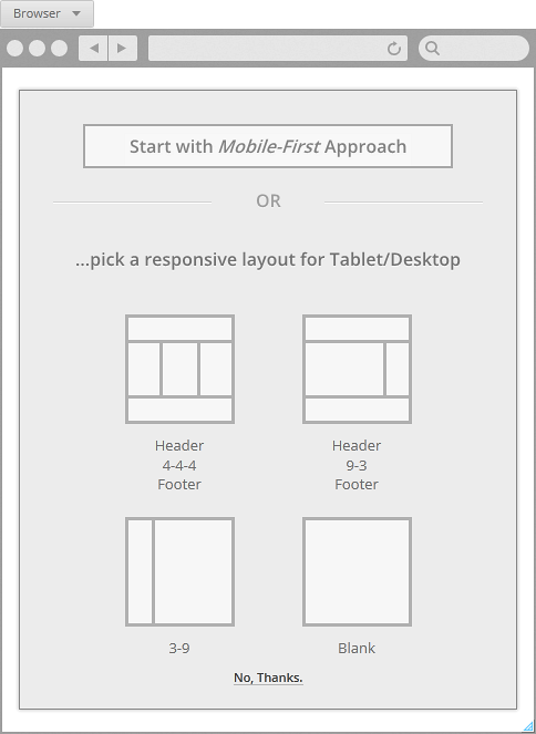
You can dismiss the responsive option by clicking on the No, Thanks link in the dialog. If you select this option, you'll have a blank canvas and your design won't be responsive.
Bootstrap container
When selecting any of the options for responsive design, Indigo adds a Bootstrap container to the canvas. This container holds rows which have cells.
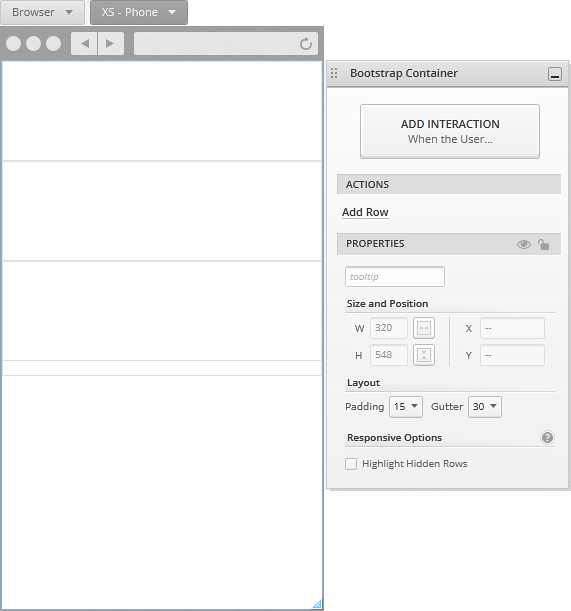
The Bootstrap container uses a 12-column structure for its layout. This applies to all elements inside the container, including rows, cells, and screen elements. You can check out the Bootstrap documentation for its grid system.
Depending on the responsive option you choose, the bootstrap container will have a layout with a certain number of rows and cells, but you can change this at any point.
In Indigo we use the name cell instead of column for the elements inside the Bootstrap container, because each row can have any given number of cells which might stack, depending on their column span and the number of cells in the row. By default, the height of cells is determined by their content. If you modify the height of a cell manually, this setting changes. To go back, you can use the Size to Content action from the Properties Panel.
Breakpoints
There are 4 available size ranges, called breakpoints. They represent the different screen sizes and devices for which you can design. By default, settings for the smaller breakpoints apply to the larger ones unless you change them specifically.
- XS
for Phone - SM
for Tablet - larger than 768 px - MD
for Desktop – larger than 992 px - LG
for very large Desktops – 1200 px and larger
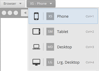
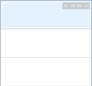
To switch between breakpoints while designing, use the Responsive Breakpoint Picker .
Layout settings
These settings vary for the different elements in a responsive design and are available from the Layout section in the Properties Panel for each element.
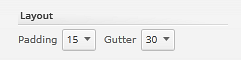
Bootstrap container
- Padding – space between the vertical borders of the container and its rows.
- Gutter – space between the content of cells that are side by side in a row.
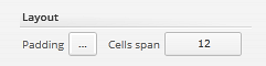
Bootstrap row
- Padding – space between the row borders and its cells.
- Cells span – predefined distribution of cells within a row.
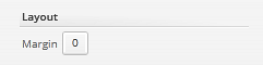
Bootstrap cell
- Margin – space between the cell and its surroundings.
Screen elements
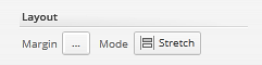
- Margin – space between the element and its surroundings.
- Mode – when set to Stretch, the elements stretch to fit the width of the cell. Dragging from the left/right to resize them adjusts their offset/column span. The other modes refer to alignment (Right, Left, Center) and when using these modes, dragging from the left/right to resize changes their width in pixels. Some elements, like the icon, can't be stretched inside a cell.
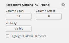
Responsive options
The responsive options can have different values for the different breakpoints. This way, you can change the look of the screen for different sizes and devices.
Responsive options include:
- Column span – width of the element measured in columns.
- Column offset – it allows you to move elements to the right, using columns as units.
- Visibility – you can use it to show/hide elements in different breakpoints.
If you are designing a breakpoint with responsive values that come from a previous breakpoint, you can see this information in the Properties Panel.
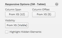
Because the settings for the smaller breakpoints apply to the larger ones, if you have an image in a cell and you change its visibility to Hidden for the Tablet breakpoint, it will be hidden for the Desktop and Large Desktop breakpoints as well. So, if you want to change this value for the Desktop breakpoint, you must do it specifically.
When you hide an element using the responsive option, that element is no longer displayed in the designer. To see it, you can use the Highlight Hidden Rows/Cells/Elements option, which also shows an indicator of the breakpoints where the element is hidden. The following image shows a highlighted hidden cell.